Heatmap Analysis for Web Usability Optimisation
- deovrat dwivedi
- Aug 9, 2022
- 5 min read
Updated: Aug 10, 2022
A step-by-step process template for UX Designers, Product Managers, data analysts and whosoever trying to derive actionable insights by analysing heatmaps (click maps, attention maps and scroll maps) and identifying opportunities for enhancing web usability.
Heat map analysis is not rocket science. However, while analysing heatmaps to enhance user engagement on TopUniversities.com, the challenge became quite daunting when I faced a dead wall. All resources available online on heatmap analysis define heatmaps and the information they convey. But unfortunately, none provides an actionable template. I aim to bridge this knowledge gap through this step-by-step process template to derive actionable insights for optimising web usability. For those unfamiliar with heatmaps, a help article by Hotjar should be a good starting point and provide a pre-cursor for the following read.

You can also listen to it on my medium blog if you are too lazy to read. But if you are still here. Lets get started.
Define Research Goals
It is always a good idea to clearly state the research goals before triggering a heatmap experiment. UX research with clearly defined goals will always drive more relevant and effective results. The checklist of the following five questions by Hotjar essentially outlines the generic research goals of a heatmap analysis. However, this list is not exhaustive and feel free to append specific research goals to this list if you have any.
Do users see the important content?
Do users click on key page elements?
Are users confused by non-clickable elements?
Why and where do users get distracted?
Do users experience issues across devices?
Setup the Heatmap Experiment
I have used Zoho Pagesense and Hotjar for setting up heatmaps; both are quite decent in terms of performance and usability. Although Zoho Pagesense is a bit more expensive than Hotjar, I personally prefer the former over the latter because of a few added advantages:
Detailed User Segment filters based on Visitor type, Source of Traffic, Country, Browser, OS, Time
Ability to save advanced filters for efficient reuse
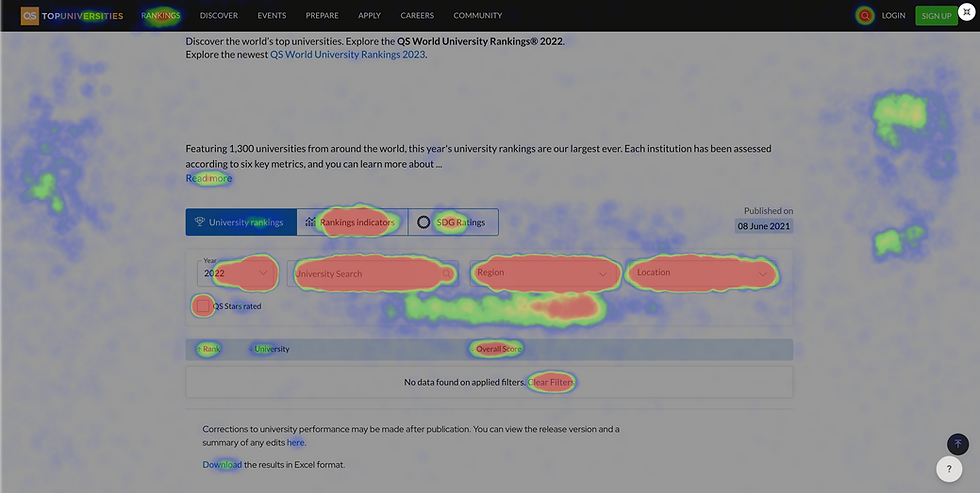
Attention Maps depict how attentive or distracted users are as they scroll through the webpage.
Split URL testing and A/B testing functionalities

To trigger an experiment add the URLs you want to run your heatmaps on a product of your choice and select the number of sessions. A data set of around 5000 completed sessions will have high confidence in analysing trends. The limit on the number of completed sessions should be the function of daily active users on the product and the time block available for the analysis for efficient data collection. However, remember that one might face lower page load speeds on the URLs where heatmap experiments run.

A google search will give you numerous products available to set up heatmaps and run your experiments. You could also check out some latest heatmap products here.
Start Analysing Heatmaps
Once the limit on the number of completed user sessions is reached, the heatmap experiment will pause, and you can start analysing the reports by following this ten step process template.
Step 1: Create user segments based on device type and visitor type.
One could also filter the source, country, web browser, operating system and timestamp data of the user based on the research goals.

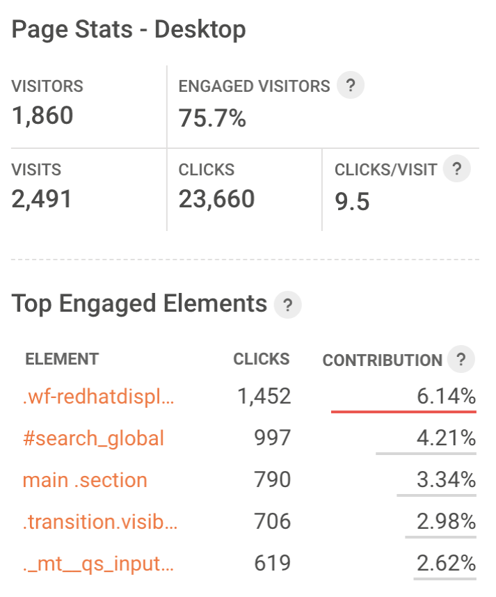
Step 2: Capture and understand Page Statistics based on relevant filters.
Page sense offers these 5 data points about page statistics as follows:
Number of Visits (user sessions)
Number of Visitors (users)
Engaged visitor (Number of users who clicked on one or more elements of the webpage)
Number of clicks per session
Clicks per Visit (Average number of clicks by a visitor in a single visit)
Step 3: Consider the frequency of user sessions on a particular device type (desktop, mobile, tab) and determine your product's preferred device type.
In today's mobile-first context, it is always a good idea to account for pain points identified on mobile devices as a priority. Once we understand the page traffic, user segment and preferred device type, we can start analysing click maps for our experiment.

Step 4: Analyse click maps to determine if users click on key page elements.
Collect consolidated data on the number of clicks from heatmaps / click-maps in an excel sheet and colour code the data for better visualisation. This data could be on Links, Buttons, CTAs, Tabs, Search bars, Navigation items and/or other clickable elements based on the research goals.
Step 5: Identify the webpage's three most and least clicked elements.
It will depict the relative traction on important product features. In addition, it highlights the gaps in how well the product's design intent is catering to the business goals.

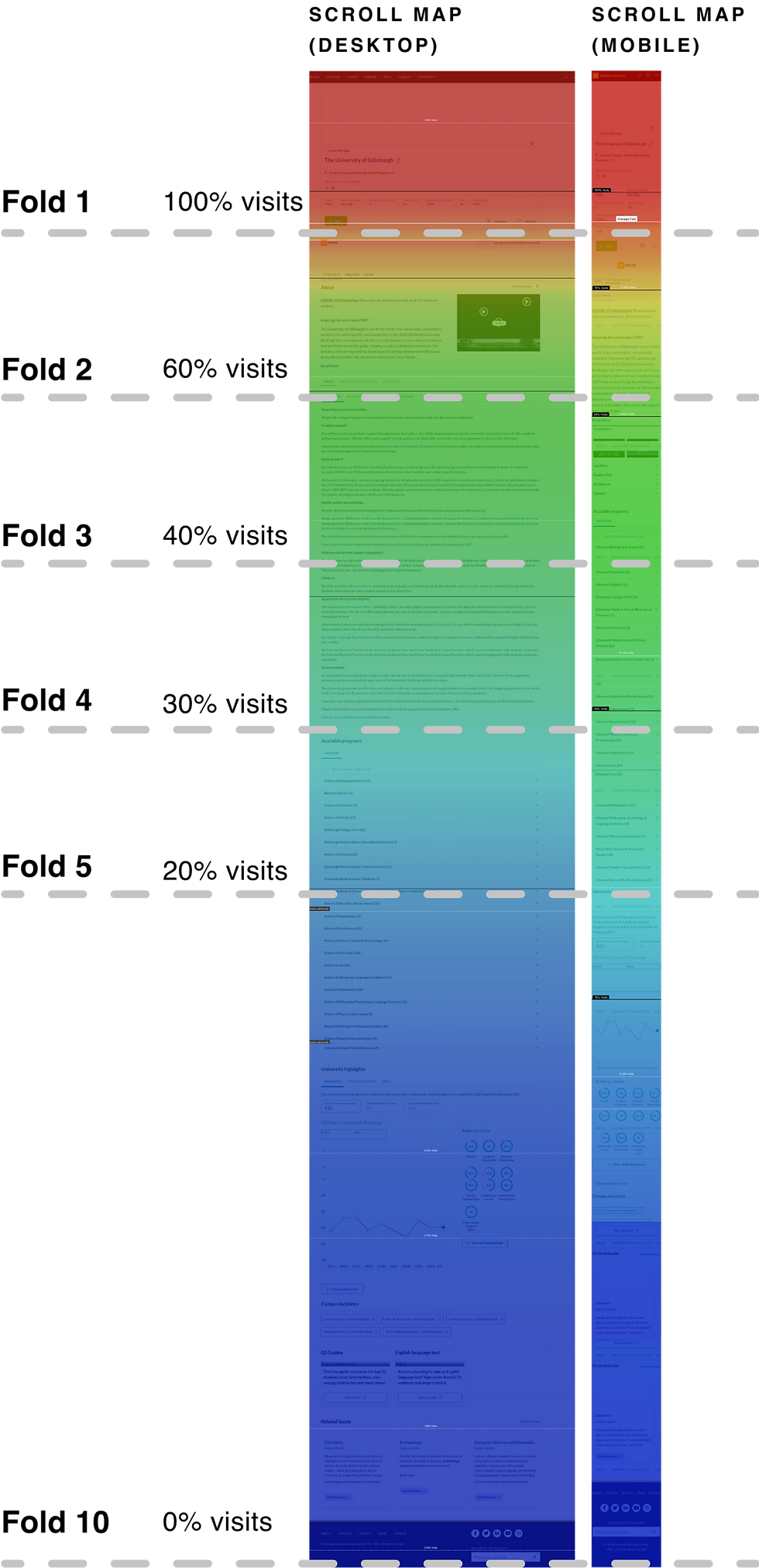
Note: For pages with a long scroll, this step should be repeated for every fold to accommodate for the low discoverability of elements hidden in the lower folds of the page.
Step 6: Check for Problem Clicks in heatmaps to find if users are confused by non-clickable elements.
While collecting data for interactive elements, we might encounter traction on design elements and UI components on the product that are not clickable or interactive. The fact that users tried clicking on a page element that was not interactive highlights a gap in the user's mental model and the existing functionality and interactions of the product. Design interventions like visual cues to differentiate interactive and non-interactive elements and creating interactions on elements with problem clicks enhance the product's user experience. Adding interactive design elements in areas with problem clicks completes the user's mental model and increases product engagement.
Note: Heatmaps record a high number of clicks on particular clickable elements subject to relative position to default state and user behaviour patterns. For instance, the second tab item in horizontal tabs, sitting next to the default state, receives a very high number of clicks compared to the default state. These could misguide our research, and one must consider default states while accounting for problem clicks in a heatmap.
Step 7: Analyse Scroll maps to find if users see the important content on the page.
Scroll Maps answer this question by showing the percentage of visitors who make it (or don't) to specific points on the vertical scroll of the page. Generally, one could infer that any information placed after the point of 40% visits has very low discoverability for users and should be either removed from the page or made more discoverable.
Step 8: Use Attention Maps to identify distraction triggers in webpages.
A user's attention span on a website is closest to currency for a tech business. As more and more digital products compete for a user's limited attention span. Attention maps can help tech businesses gauge this form of currency by depicting data on the average time spent by a user on a particular part of a webpage. Red marks areas with the highest attention span, and blue shows areas with the lowest attention spans.

The parts of the webpage scroll with the average user attention span of less than 10 seconds are not actually being used by the user. Long text blocks and/or uncondensed list components are some common distraction triggers on web pages.
If you are interested, check out an interesting article by nngroup.com on Attention Economy.
Step 9: Do a Device Type Comparative analysis of heatmaps to understand if users experiencing issues across devices.
Generally, desktop versions of responsive webpages will have a higher attention span than a mobile device. This is because the default user behaviour to scroll on a mobile device is responsible for low user attention. Place click maps, attention maps, and scroll maps beside each other for all devices to understand
Max and Average Attention Span across devices.
distraction triggers
attention and distraction areas
discoverability of content across devices
Step 10: Consolidate your findings in a Summary table
The final step should be to consolidate the fold-wise list of Problems and Opportunities identified by the heatmaps, scroll maps and attention maps analysis on a spreadsheet and map one or multiple solution hypotheses for every line item. This document will be an actionable output from the complete page analytics experiment to be shared with relevant stakeholders.

Thanks for reading. I hope that helps. 🙂
Comments